By now we are sure you have heard that the 2020 Pantone Colour of the Year is Classic Blue. Blue is often seen as a calming and quite versatile colour that can be used throughout accessories and even feature walls in your home. So, how should you use Pantone 19-4052 Classic Blue?
What Is Classic Blue?
Pantone described their Colour of the Year as ‘Instilling calm, confidence, and connection, this enduring blue hue highlights our desire for a dependable and stable foundation on which to build as we cross the threshold into a new era’ (Pantone Colour Intelligence). The meaning of this colour inspires us to think about modern and innovative design and how we can use this colour to best bring about a sense of calm because we can all use a little more of that!

In The Bathroom
Bathrooms have been the subject of recent design trends whereby this space is turned into a sanctuary where you can figuratively and literally wash the day that was, away. Invite blue into the bathroom as a homage to the tranquil ocean. We love the look of blue subway tiles as a nod to the colour and also a very popular design trend at the moment. Subway tiles are also a simple feature that can stand the test of time as they can be accentuated or blended into the background as necessary. Don’t stress about getting the colour of the tile spot-on to the Colour of the Year, choose what works best for your bathroom and a colour that you will enjoy looking at years down the track.

In The Kitchen
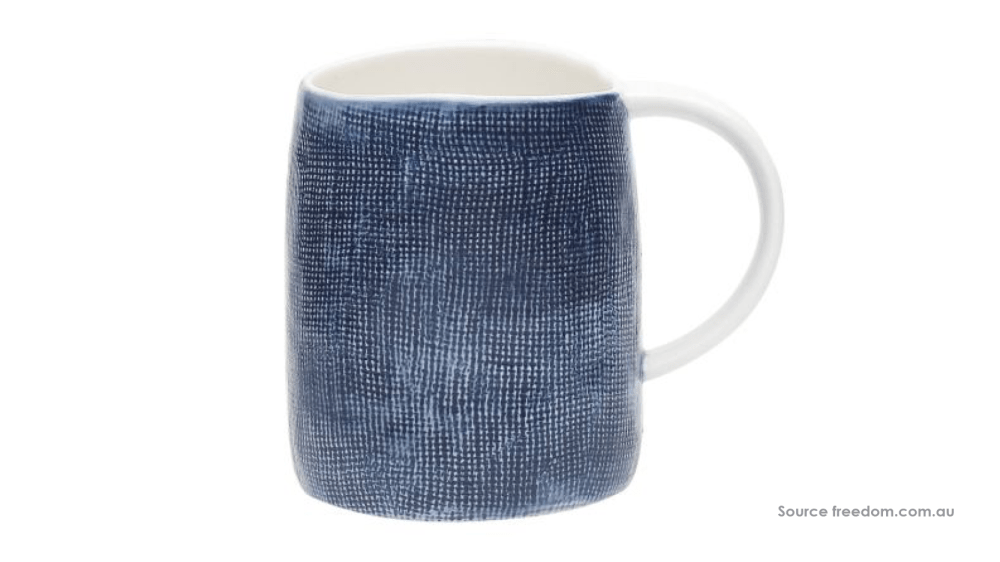
A kitchen is always an easy space to incorporate colour, whether it be tea towels, a splashback, bar stools or even your kettle and toaster. If you’re looking for a subtle way to include Classic Blue you can opt for one of the options above or update your kitchenware with some confidence-boosting blue mugs like the ones shown below from Freedom (you can get the matching dinner set too!). Or if you’re feeling bolder, accent your kitchen by painting the base of your kitchen counter blue. This space isn’t directly in view so can still be impactful without being overt.
In The Living Areas
Finally, add some Classic Blue to your living areas to invite connection into the rooms. Blue drapes will certainly add a moody touch to any room and is perfect if you love a bit of drama. Alternatively, drapes in this shade can also make a space feel a little cosier, like the bedroom pictured below. If you’re not a fan of heavy window furnishings, the go-to accessories to update can include throw rugs, cushions and don’t forget about picture frames! If you really want to tie blue into a room a rug can make the statement you’re looking for. Opt for something that is solid in colour if you want that big impact, or, choose a rug that incorporates white or cream hues to help you style the rest of the room or invite a little more light into the space.

How will you be using Pantone’s Classic Blue in your home?